These guidelines are your source of truth for how our brand looks, sounds, and shows up in the world. Here, you'll find our brand elements, visual examples, and guidance for creating work.
Homebase
Homebase strives to make hourly work easier for every small business. Our app brings together scheduling, time tracking, and payroll—using AI thoughtfully to help teams focus less on admin and more on the work that matters.
Brand
Our Homebase brand is about what we do, make, and say. How we present ourselves to the world. The more cohesive and consistent our efforts are, the more we resonate with—and convert—our audience.



Our brand promise
To make hourly work easier for every small business.
Our brand work reflects the ethos of the small businesses we serve—guided by these four principles: human, approachable, impactful and crafted.
We reflect the realities of small businesses. Our work captures authentic experiences that resonate with the people we serve.
We meet people where they are through simplicity and warmth—removing barriers and creating work that feels welcoming.
We keep people engaged through bold, thoughtful ideas and execution—always pushing forward without sacrificing clarity.

Logotype
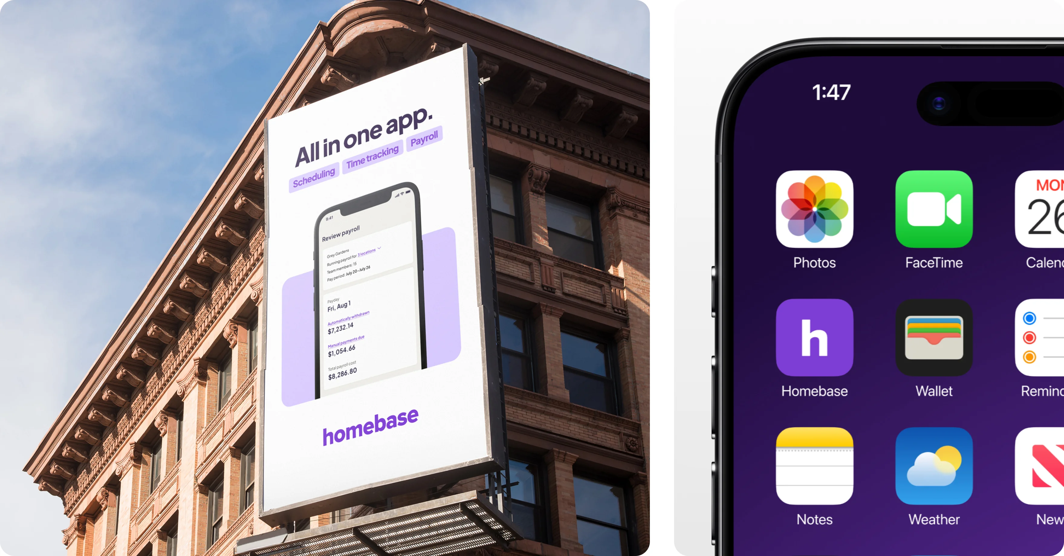
This is our primary logo. It should lead all high-visibility and external-facing communications, ensuring strong brand presence and recognition.
Use the logotype across: email, print, advertising, social content, and paid marketing campaigns. For someone encountering our brand for the first time, the logotype establishes who we are.
Logomark
Our secondary logo is used selectively. The logomark functions as a simplified brand identifier, ideal for small spaces and places where the logotype is impractical.
Appropriate uses include the app icon, social profile icons, and specific in-product experiences. It should never replace the logotype in broader brand communication.
Usage rules
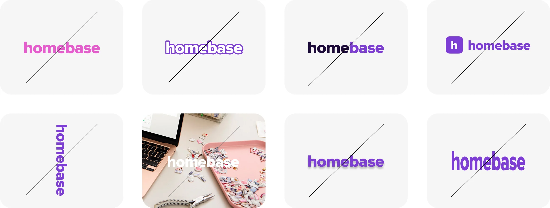
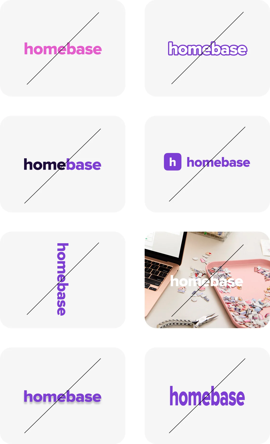
Our logo, logotype and logomark, should never be altered or modified in any way. It may only appear in Purple Haze or white — no other colors are permitted.
The logotype should never be outlined, stylized, or adjusted, and must always appear as a single, unified color without being divided or separated.
The logotype and logomark should not be used together; always choose one or the other based on the context.
- Always use the full lowercase logotype as the primary mark
- Use Purple Haze on light or white backgrounds
- Use White on dark or purple backgrounds
- Maintain generous clear space around the logo on all sides
- Use the h icon only in small-space or app icon contexts
- Capitalize or alter the casing of the logotype in any way
- Apply outlines, strokes, drop shadows, or glows
- Rotate, skew, or distort the logo
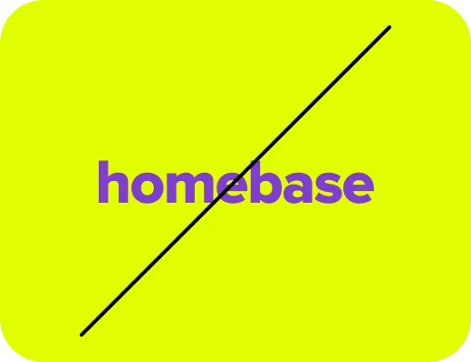
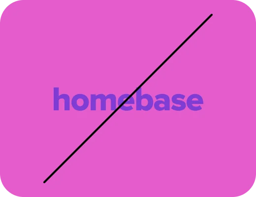
- Place on busy or low-contrast backgrounds
- Use any color other than Purple Haze or White
- Pair the h icon alongside the full logotype
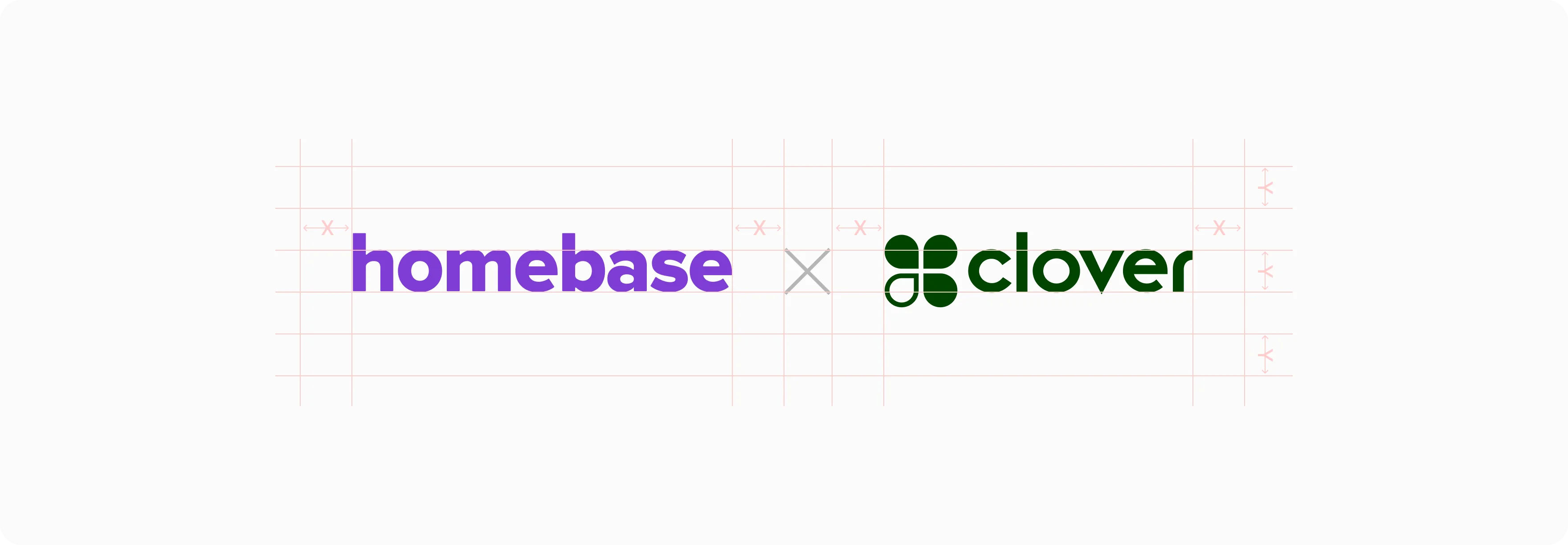
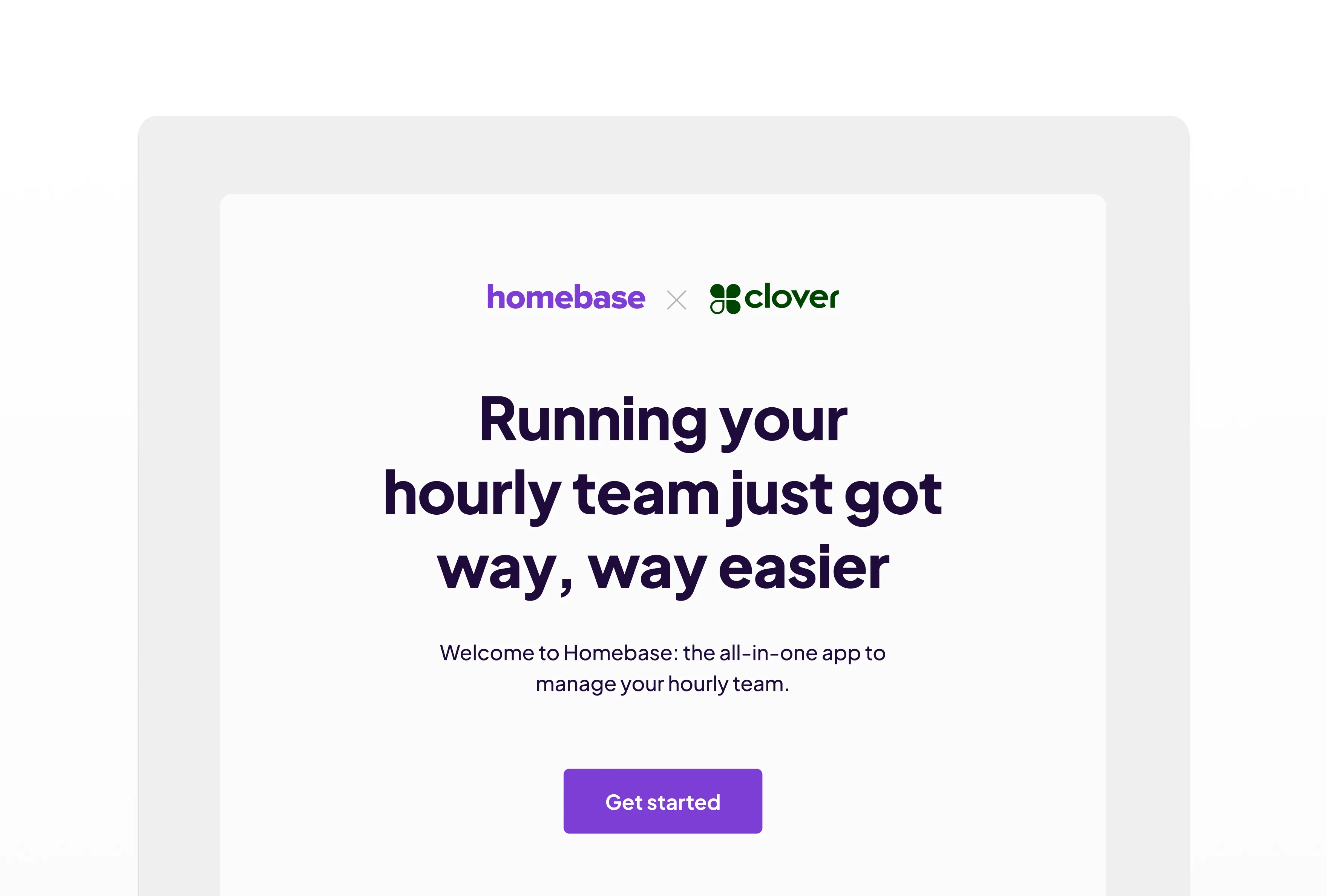
We collaborate with many partners, and our campaigns often feature both our logo and a partner's logo. In these cases, the two logos should be separated by an "X", with equal spacing between each logo and the "X" to maintain balance and clarity.
Separation
Always use an "X" between the homebase logotype and the partner logo. Maintain equal spacing on both sides of the "X" — the spacing from each logo to the "X" should be identical.
Sizing
Pay close attention to sizing—logos should be adjusted so they appear optically equal, ensuring neither brand outweighs the other.
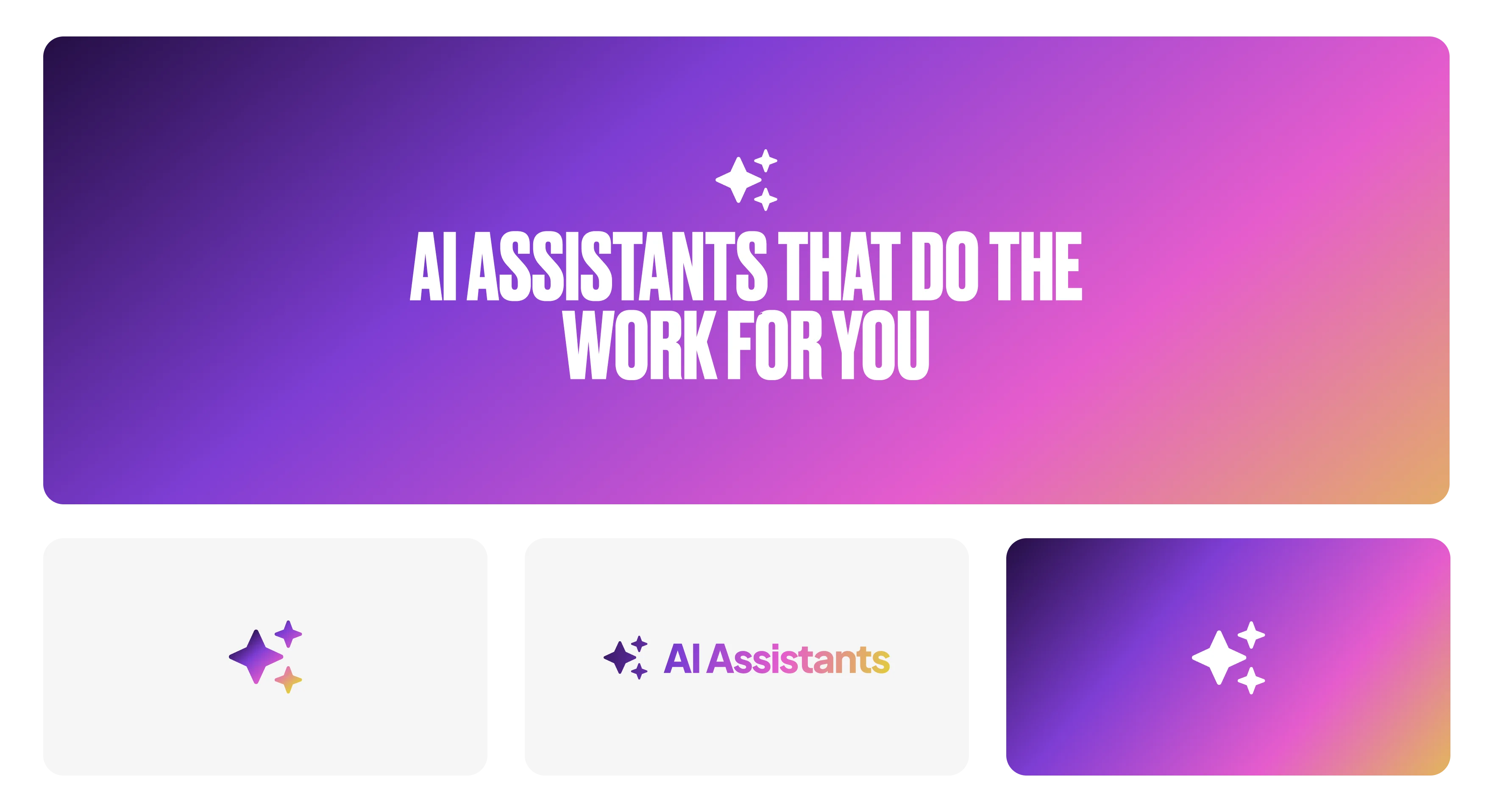
Assets promoting our AI Assistants use our spectrum gradient to add energy and relevancy. The sparkles icon further distinguishes AI Assistants from our other offerings.
✦ Sparkle Icon
The four-pointed sparkle (✦) marks AI-powered features and surfaces. It signals "this is AI" without over-explaining. Use it as a small badge or inline indicator next to AI feature labels and entry points.
Spectrum Gradient
Deep Purple → Purple Haze → Pink Floyd → Yellowcard. This gradient is exclusively for AI branding contexts — do not use it anywhere else. It expresses intelligence, energy, and possibility.
Primary Colors
Purple Haze and white serve as our core brand colors, anchored by Deep Purple for depth and contrast. These colors form the foundation of our visual identity and should appear consistently across all brand touchpoints.
Secondary Colors
Our secondary palette includes Yellowcard and Pink Floyd. These colors provide flexibility and accent moments but should always support—never overshadow—the primary palette.
Pairings, Proportions, and Backgrounds
Purple should remain a constant element in our color usage. Color on white—or white on color—provides the strongest, cleanest expression of the brand. When creating compositions, limit palettes to Purple, white, and no more than two secondary colors at a time to maintain visual clarity.
Gradients
We use two primary gradients, each grounded in our signature Purple Haze.
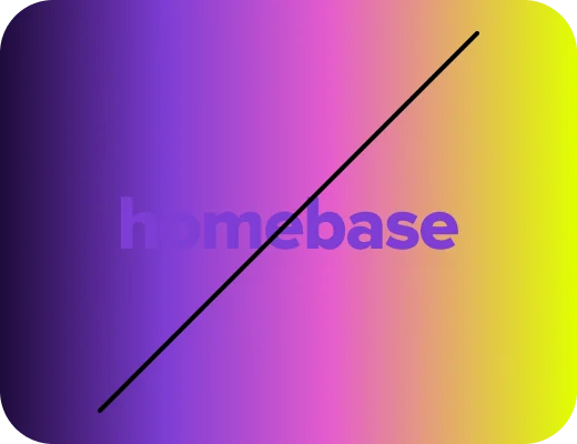
Gradients should be applied thoughtfully and sparingly. The spectrum gradient should never be used as a background; reserve it for smaller, accent-level applications where it can add energy without overwhelming the design.
How we approach color
Purple Haze is the anchor of our visual identity and should always be present in our compositions.
Secondary colors should be used sparingly and only to support key moments. Yellowcard and Pink Floyd should never be used as primary colors or background colors.
The full spectrum gradient should also never serve as a full-background treatment; reserve it for smaller, accent-level applications where it adds energy without overwhelming the design.
Maintain strong contrast at all times. Light backgrounds should pair with darker elements, and dark backgrounds should pair with lighter elements to ensure clarity, accessibility, and visual balance.

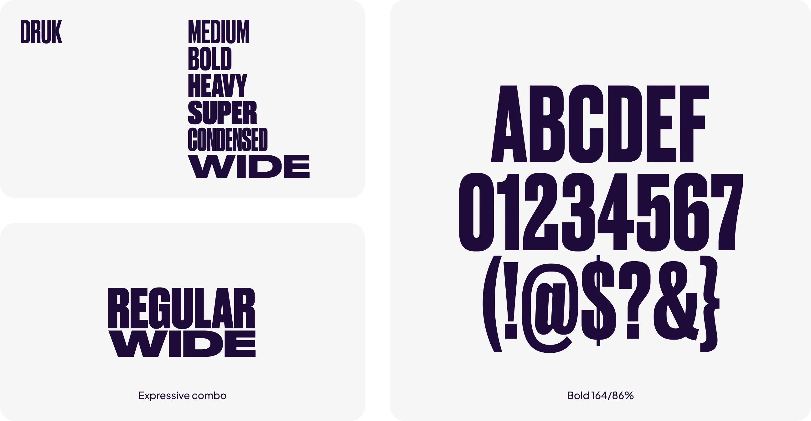
Druk — We use Druk Bold and Druk Bold Italic for impactful, high-energy moments. Druk Bold can serve a purely functional purpose in titles or take on a more expressive role when paired with other Druk weights and sizes.
work easier.
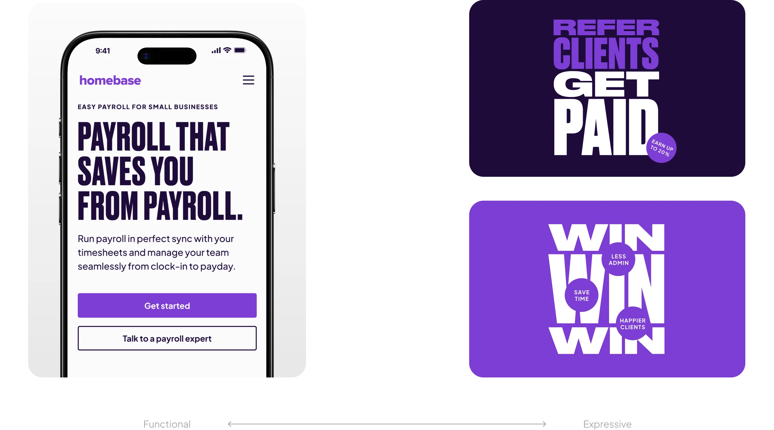
Druk is a core part of our brand voice, and we use it in two ways: functional and expressive.
Functional Use
For functional typography, we always use Druk Bold. Its clarity and weight make it the most readable choice for:
- Website H1s
- Primary campaign headlines
- Titles in PDFs, decks, and presentations
Expressive Use
In more creative or artistic applications, we can use any weight of Druk, including Druk Condensed and Druk Wide. This is where type can become part of the visual expression itself, allowing scale, contrast, and combinations of styles to create energy and personality.
What Not to Do
While Druk Condensed and Wide styles are great for expression, they should never be used functionally. Their proportions reduce legibility, making them unsuitable for headlines that must be read quickly and clearly.
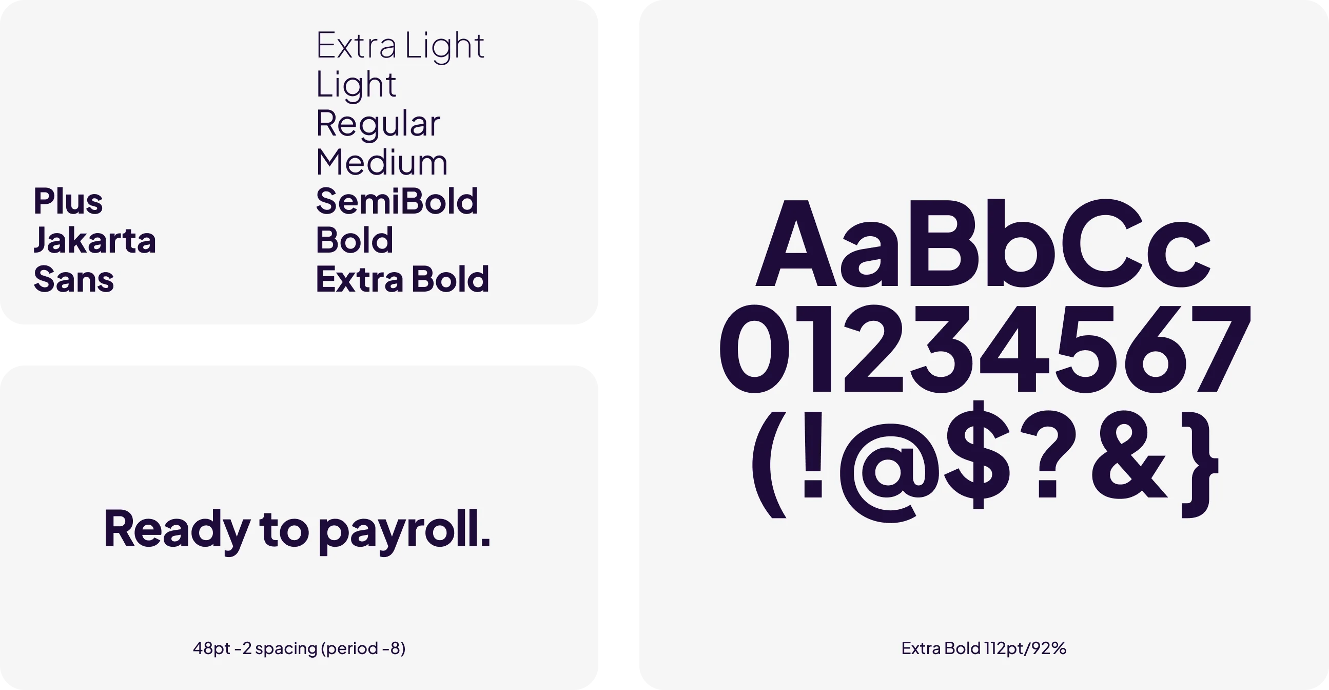
Plus Jakarta Sans — Plus Jakarta is our primary, hardworking typeface for both headlines and body copy. We use Extra Bold for headlines and Medium for body copy. Because Plus Jakarta has a naturally lighter structure, Medium provides better readability than Regular in most cases, though small exceptions may occur.
Grow your business.

Large Icons
Large icons are used as small visual accents to emphasize key messages or to add subtle background interest. Apply them thoughtfully to avoid overwhelming the layout.
Hand-Drawn Elements
Hand-drawn marks help draw attention to specific content. Use them sparingly—one or two at most—to maintain clarity and avoid visual clutter.
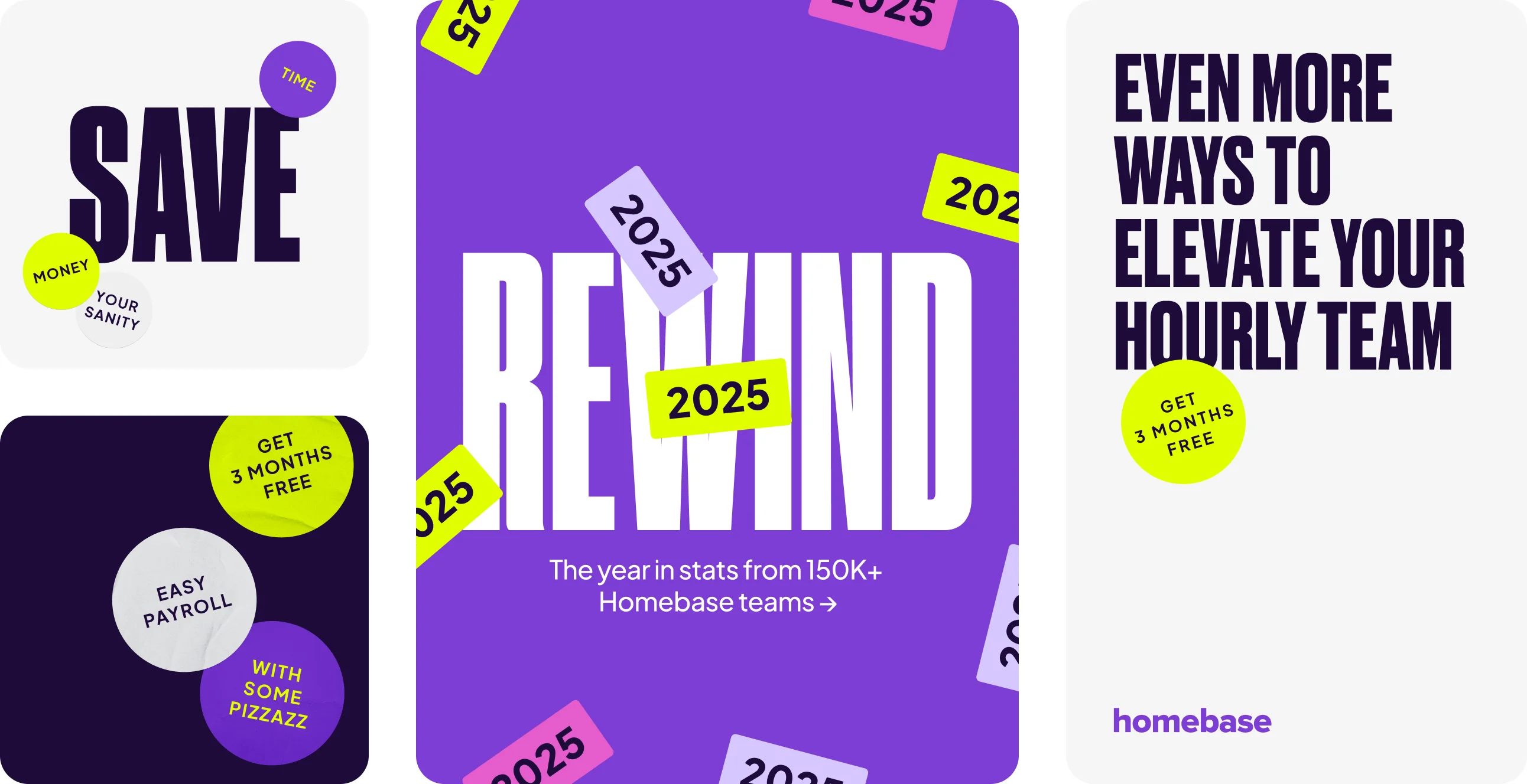
Stickers
Stickers add depth, personality, and moments of emphasis. They should be used selectively and never in excess.
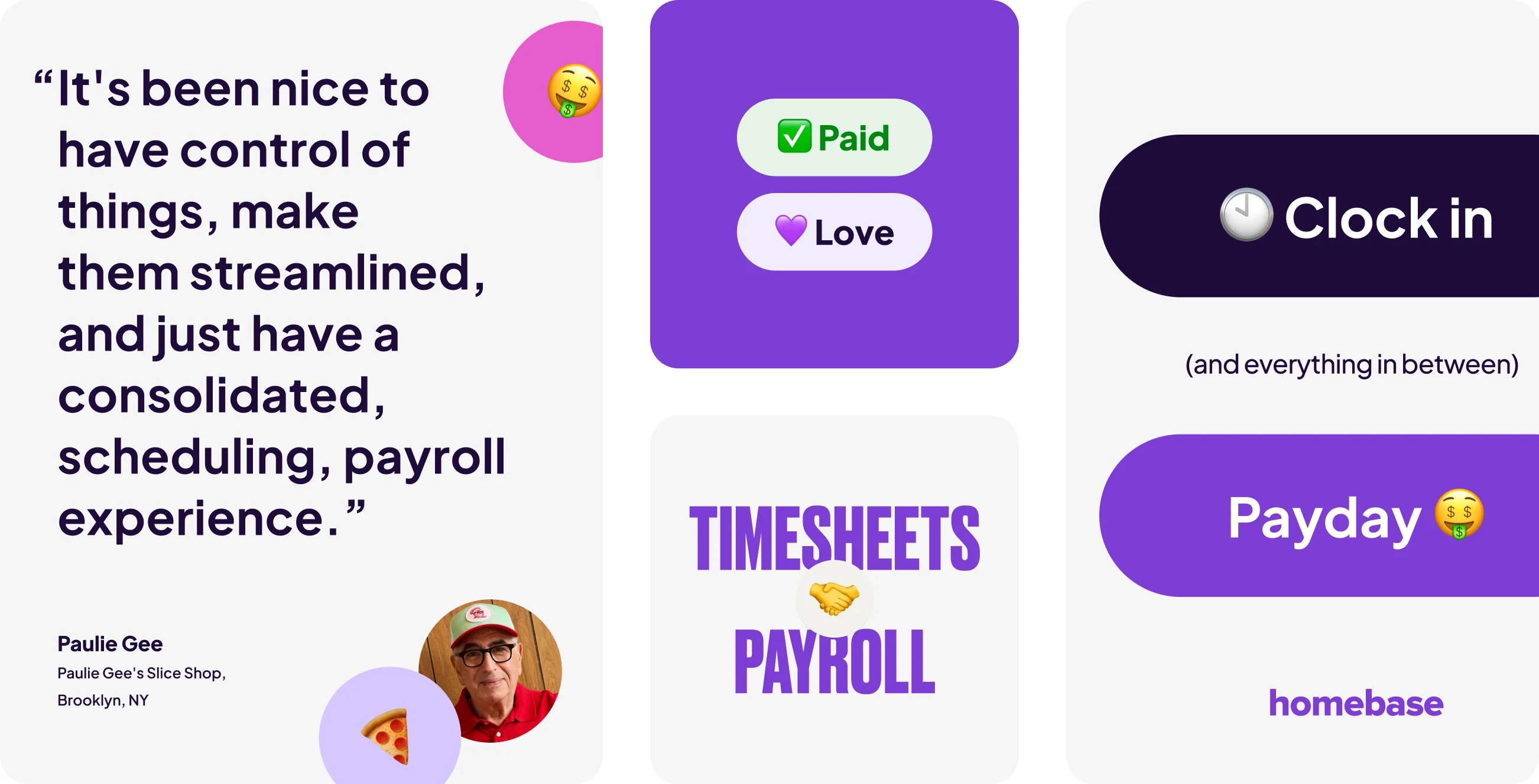
Emojis
Emojis introduce energy and informality to certain pieces. Use them with restraint to ensure they enhance the message rather than distract from it.
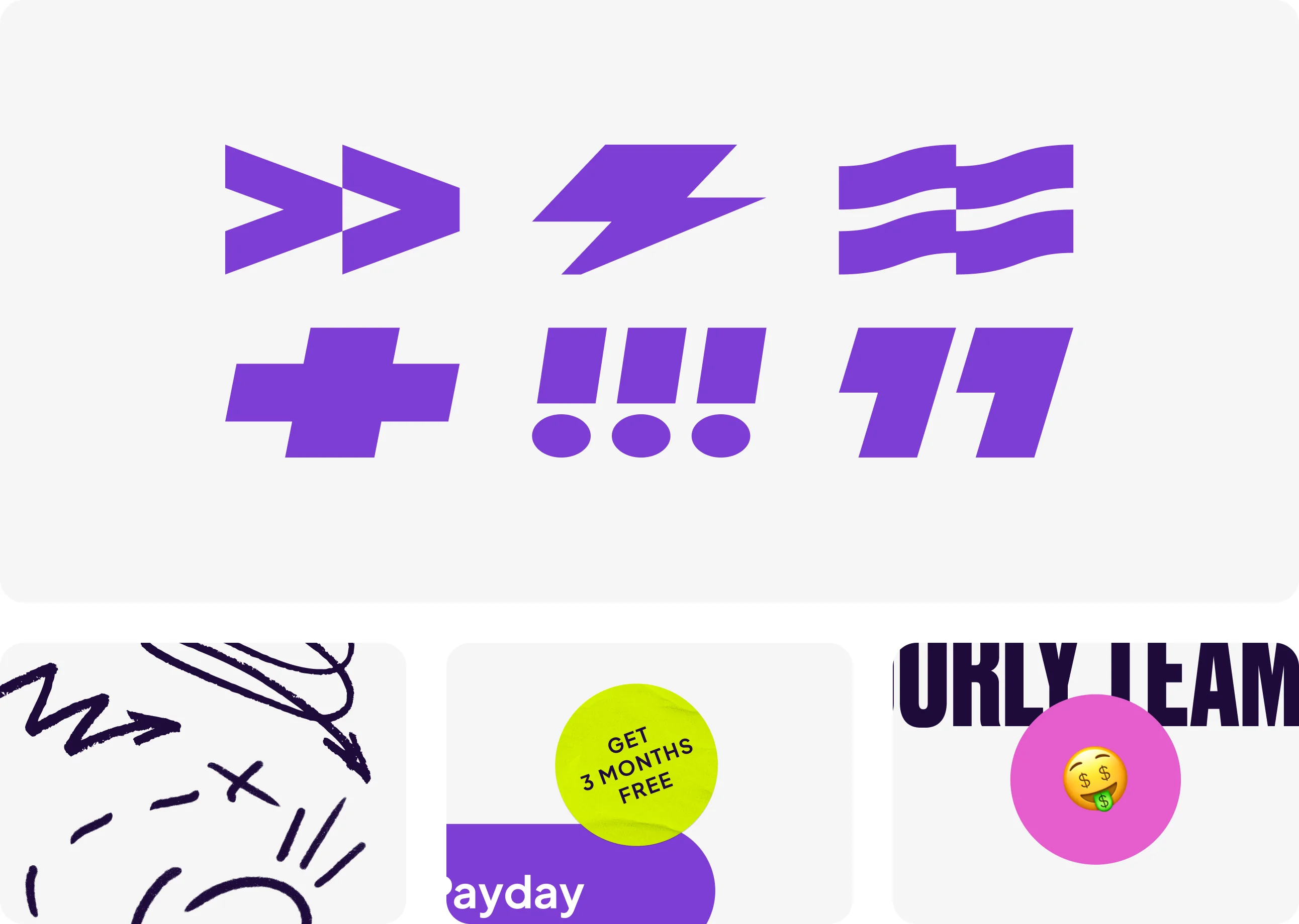
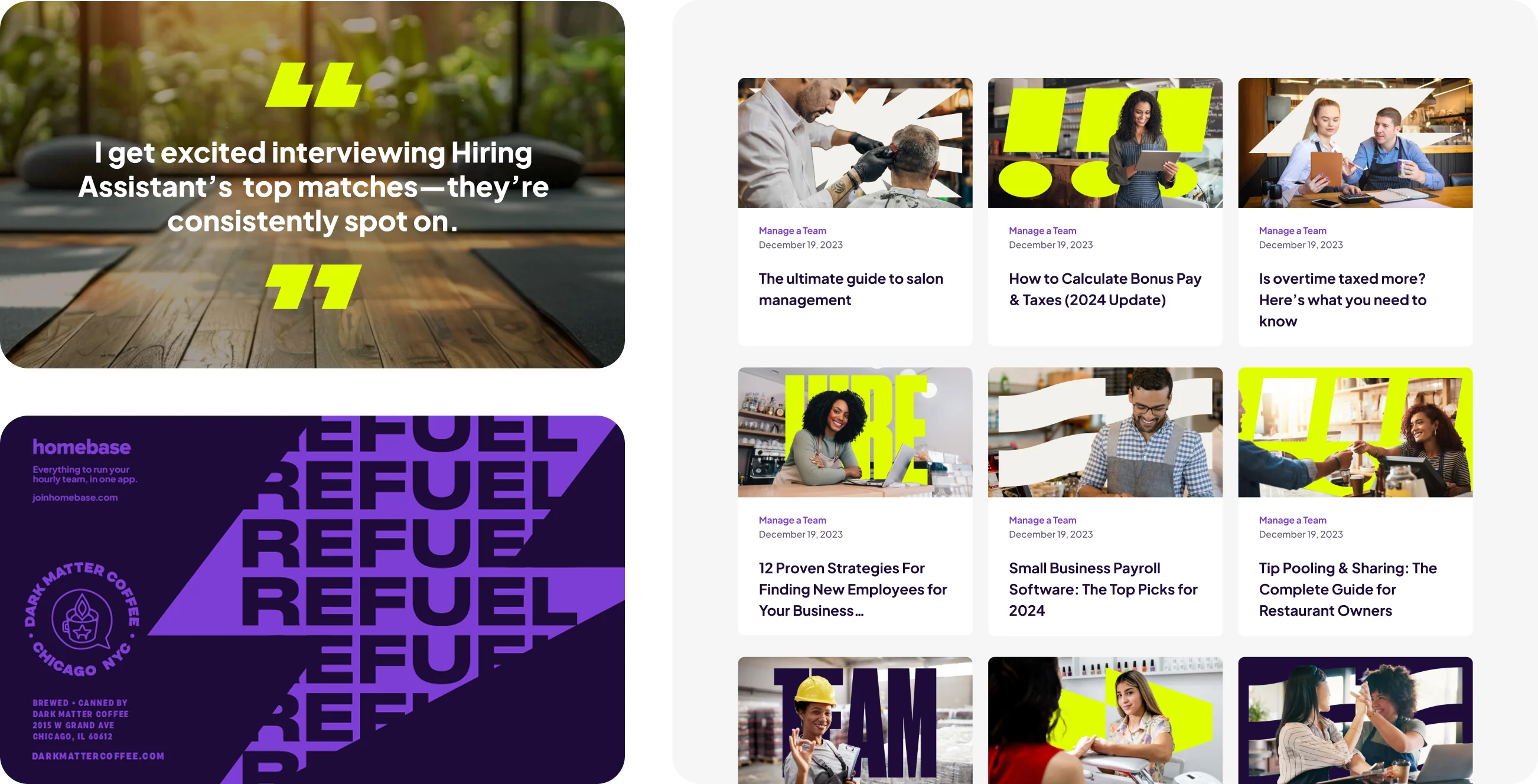
Large Icons
Large icons serve as versatile visual elements that can either subtly accent messaging or create depth and texture as background graphics. They add energy and emphasis without overpowering the core content.
When used alongside text, limit large icons to one or two to maintain clarity and balance. They should always appear upright and never angled to preserve consistency and visual stability across applications.
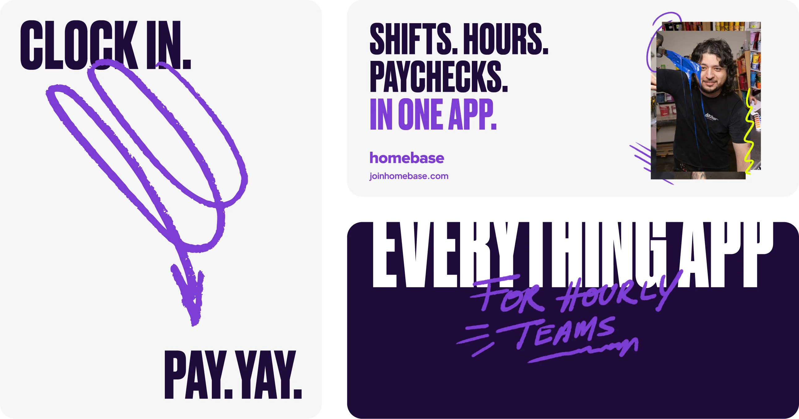
Hand-Drawn Elements
We use hand-drawn elements to introduce a human touch and to draw attention to specific parts of a layout. These elements should always be balanced by standard typography and other design components—they should never become the primary or sole visual focus.
Hand-drawn elements work best in small, intentional moments. Use them sparingly to maintain their impact; overusing them diminishes their purpose of adding subtle interest and guiding attention without overwhelming the design.
Stickers
Stickers are used to call attention to key moments or to bring a sense of playfulness and life to a design. They should always support the composition—not dominate it.
Use stickers sparingly, limiting their presence to one or two per layout to maintain balance and avoid visual clutter. Stickers may include short words or phrases (typically 3–6 words for smaller stickers) as well as emojis or simple icons.
Stickers should complement other design elements and never serve as the primary focal point. Their role is to enhance—not replace—core messaging.
Emojis
We use emojis to draw attention or to bring energy and personality to a piece. They can be used as larger graphic moments or placed within body copy to emphasize specific words, phrases, or messages.
Emojis should always function as supporting elements—never the only visual component. Their role is to enhance and highlight key ideas, not replace core content. Use them intentionally and in moderation to maintain balance and clarity.
We use a range of background styles—from textured and dynamic to clean, simple white or purple fields. Regardless of the style, backgrounds should always support the content placed on top of them.
They should never overpower the artwork or typography, but instead complement and balance it, ensuring the message remains clear and visually accessible.

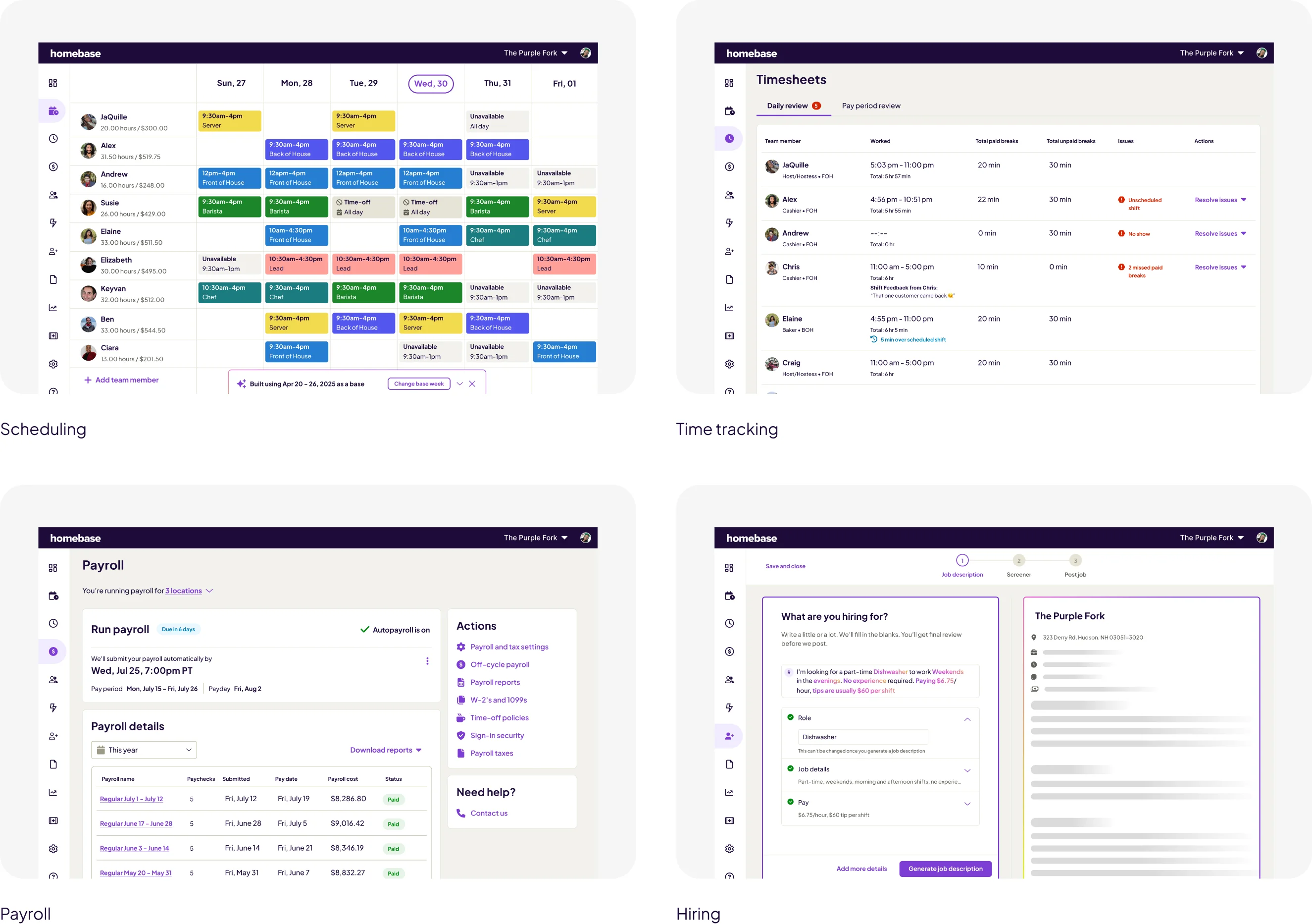
Full, Detailed Screens
We use full-scale, detailed product screens to clearly demonstrate what our product looks like and how it works. These are shown at a larger size to highlight functionality and design.
Full product views are also used in context—such as on laptops, tablets, or handheld devices within photography—to show the product in real-life usage.
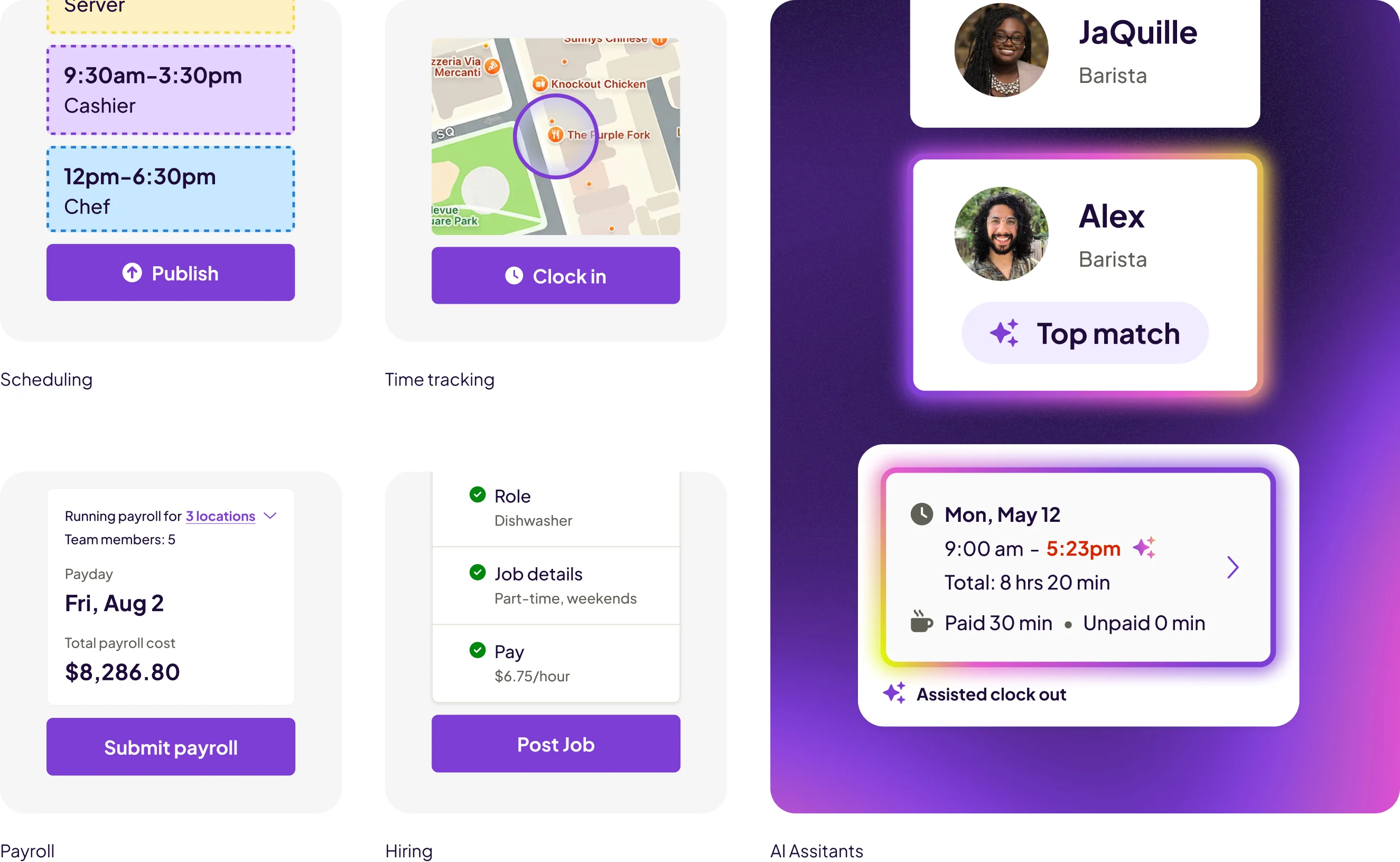
Smaller, Simplified Screens
We also use smaller or less detailed representations of the product when we need to communicate an idea quickly. These simplified elements help convey core functionality without requiring full interface detail and work well in layouts where space or clarity is a priority.

Our photography celebrates the people who make small businesses run: owners, employees, and teams.
Overall
We want people to look natural. We want to show them as everyday heroes who are relatable and inspiring. They should be candid, warm, and friendly.


Here are a few things to keep in mind when using photography, or on a photoshoot to capture new images.

People
Feature small business owners, employees, and teams (groups).

Products
Highlight what the business sells or makes. Keep it simple.

Spaces
Capture the space and special details to give a sense of place and personality.

Compositions
Consider each subject and surroundings to get the best composition. This might include different angles and moving locations.

Lighting
When possible: use natural light. Avoid direct midday sun and heavy shadows.
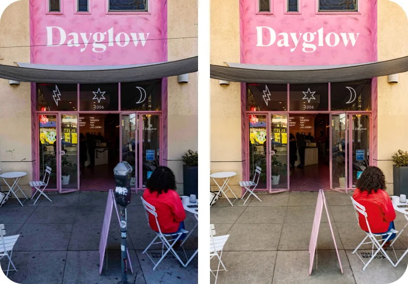
Retouching (as needed)
We use retouching to clean things up, but want to ensure images look natural and real. Keep palette warm and rich.

DoShow people in the moment.
Don'tNo formal poses.

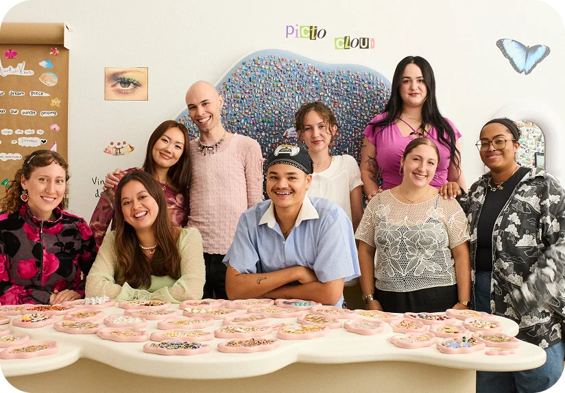
DoShow teams with good energy and plenty of light, if possible.
Don'tUse awkward compositions.
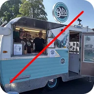

DoCrop to the best composition.
Watch outFor awkward tangents.

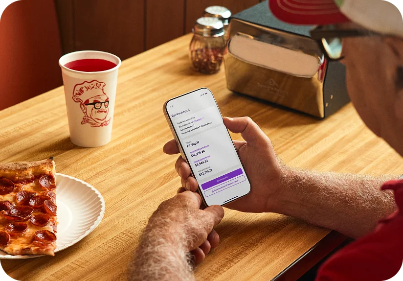
DoShow Homebase product in-use, when possible.

DoEnsure resolution is good. We save out pics at 2-3X for social posts.

DoUse a warm overlay when placing typography over image, for readability.
ColorR 210 G 205 B 200
Voice is how Homebase always sounds and how we keep the brand consistent. No matter where we appear, we are:
We have deep respect for small businesses and the people behind them. Show up as a neighbor they can always lean on. Be kind, approachable, and use everyday language familiar to a wide range of teams.
We take pride in saving people time and have compassion for the people before them. When a message is easily understood, it's easier to act on. Prioritize what's most valuable to the reader.
We're dedicated to making work easier for small businesses. Our voice should reflect our steady passion for problem-solving: confident, reassuring, and focused on helping teams move forward.
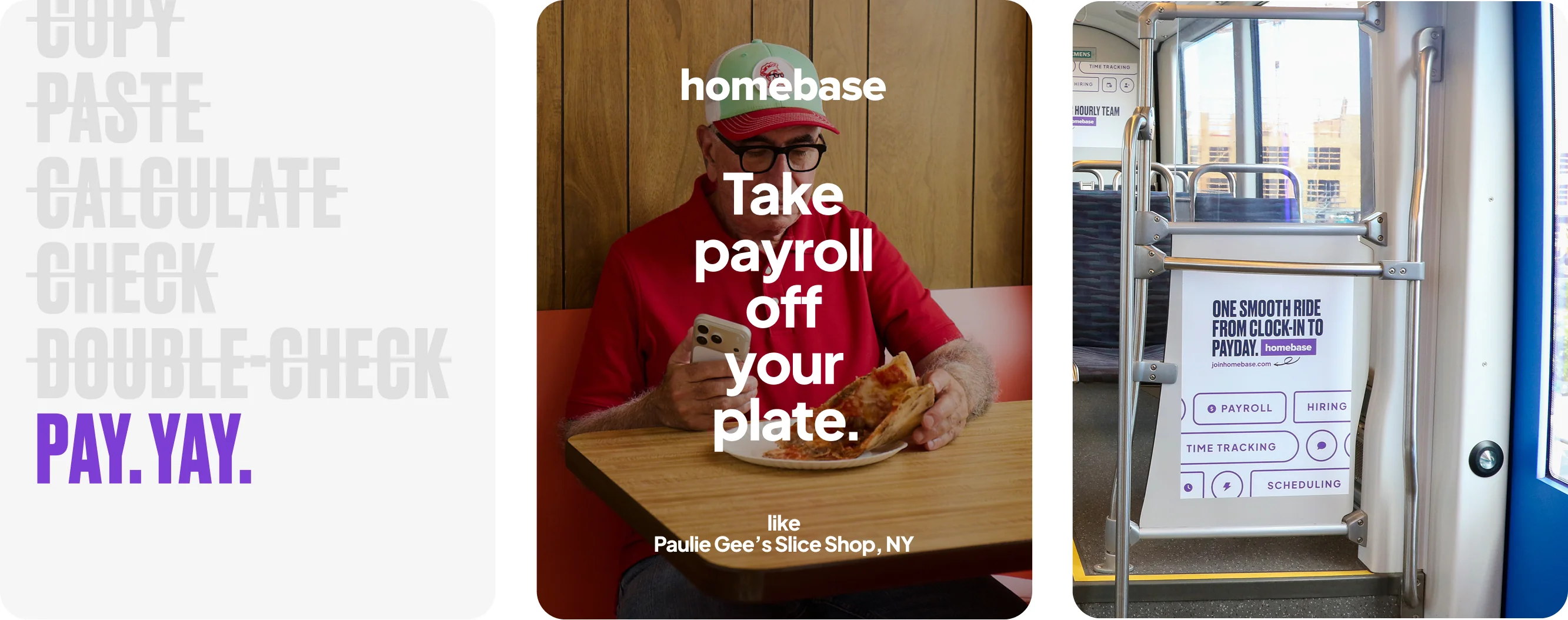
Voice
Neighborly
Helpful. Relatable. Accessible.
How to be Neighborly:
Be a person, not a platform.
Write like you talk. Avoid technical jargon, speak conversationally (but not overly slangy).
Don't overdo wit.
If there's an opportunity to be fun or clever with your words, go for it — but don't force humor everywhere.
Be inclusive.
Write so people across various industries, backgrounds, and abilities feel welcome and understood.
This.
- Empathetic
- Conversational
- Relatable
Not This.
- Judgemental
- Clinical
- Detached
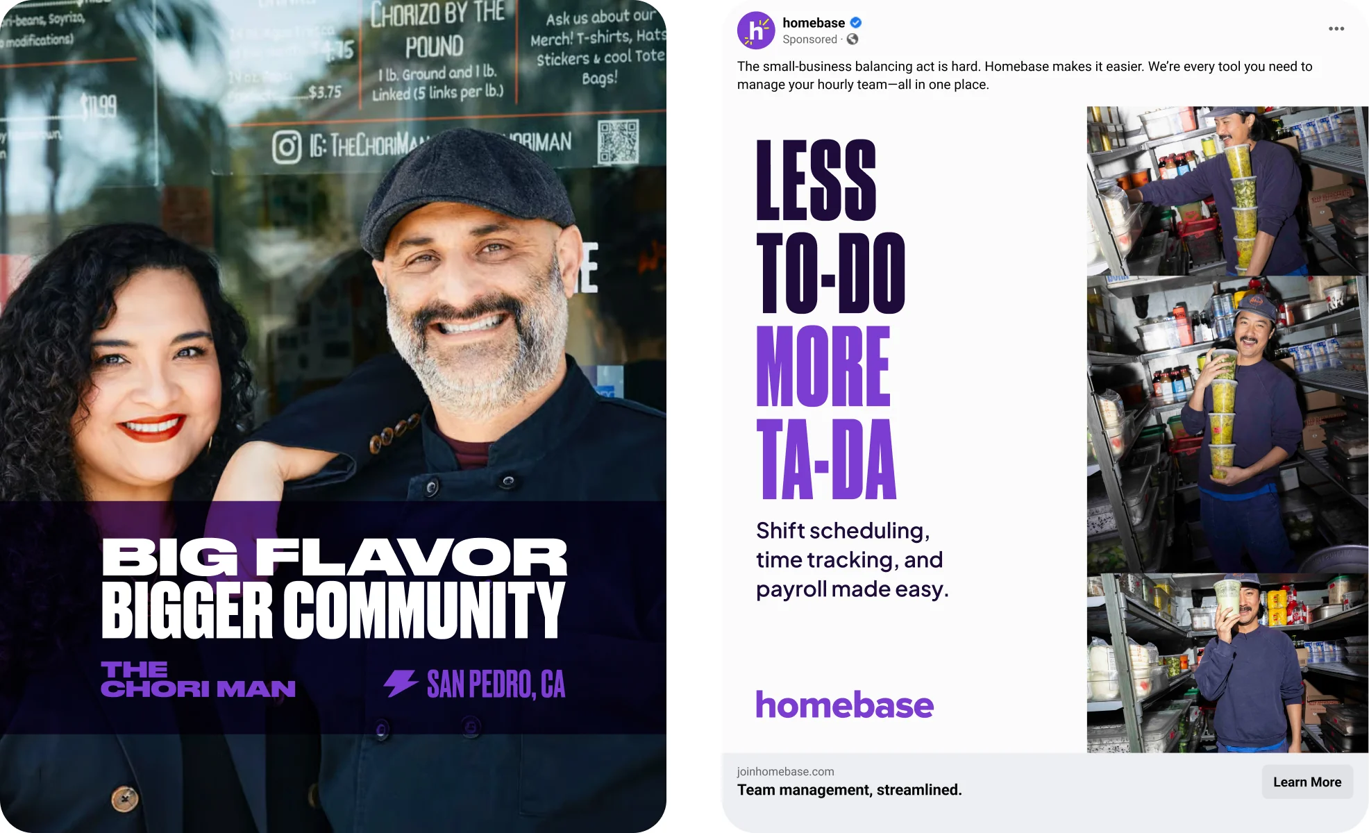
Clear.
Straightforward. Direct. Transparent.
How to be Clear:
Be the audience.
Read your message like someone seeing Homebase for the first time. If it feels too "insider," simplify.
Lead with what matters.
Put the most important information first. Cut anything that doesn't feel useful or actionable.
Keep it short.
Don't sacrifice clarity for brevity, but always respect the reader's time and attention. Make it easy to digest.
This.
- Informative
- Direct
- Concise
Not This.
- Overwhelming
- Meandering
- Sparse
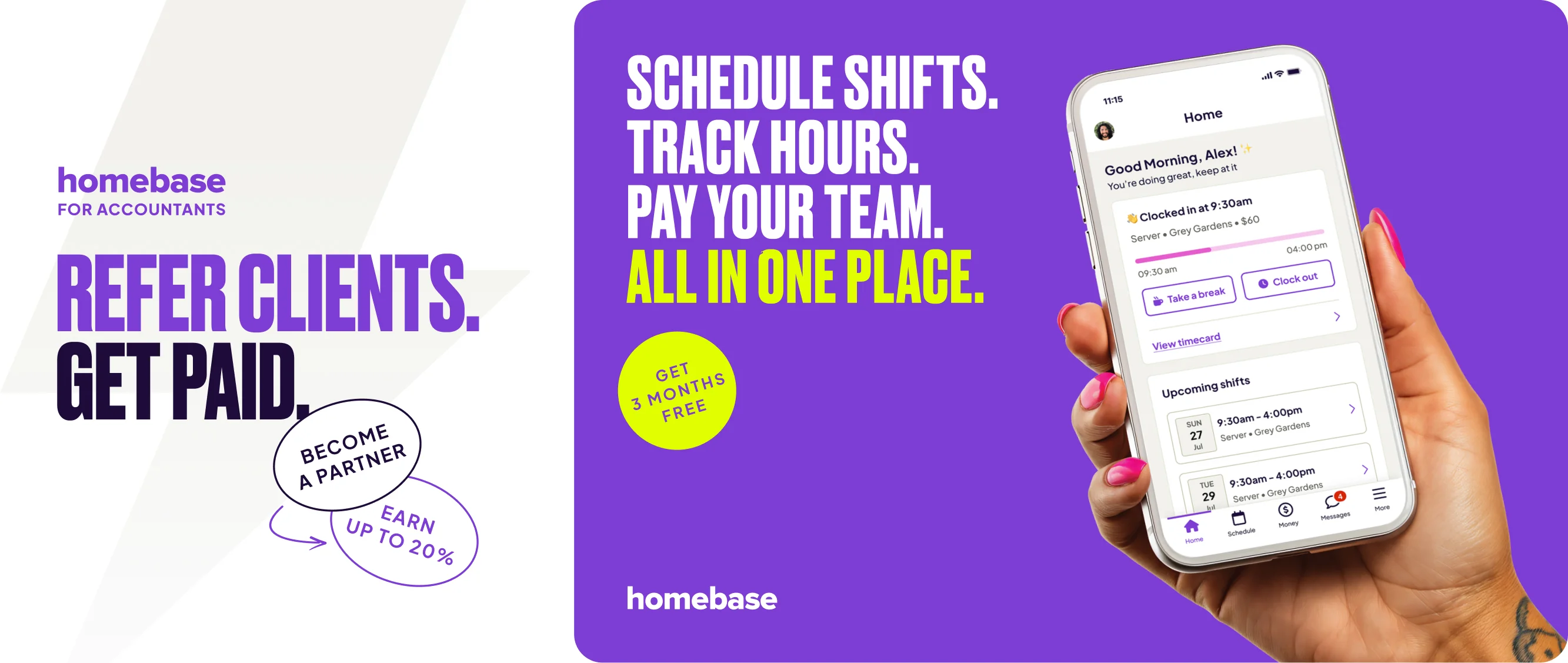
Proactive.
Confident. Ready. Reliable.
How to be Proactive:
Show, don't tell.
Build trust with real product behavior, stats, customers, situations — avoid exaggeration or vague promises.
Bring energy — with purpose.
Write with optimism and momentum, but keep it real. Avoid over-hyping, use exclamation points sparingly.
Explore fresh ways in.
Avoid repeating the same phrases or angles. Consider new ways to engage the reader without losing clarity.
This.
- Confident
- Enthusiastic
- Innovative
Not This.
- Know-it-all
- Off the walls
- Eccentric
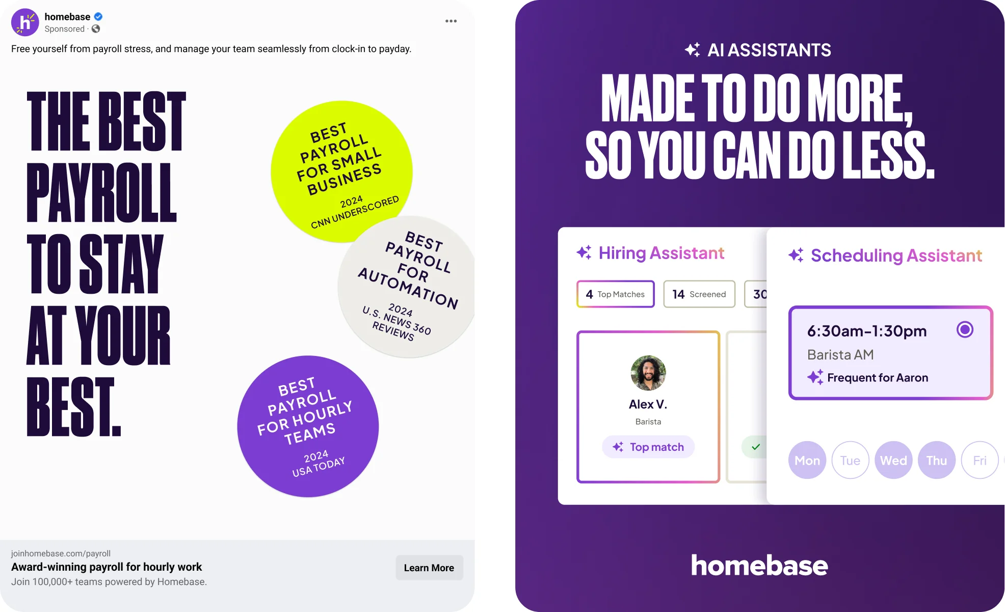
Tone
Our voice is constant. Our tone is how we can adjust our voice for specific moments across the customer journey:
First interactions Paid social, direct mail, OOH, audio, partnerships
Welcoming and clear. Make it obvious what Homebase offers.
Consideration Website, app store, sell sheets
Confident and informative. Answer questions and build trust.
Education Product pages, launches & updates
Bold and direct. Highlight benefits and explain how it works.
Engagement Organic social, lifecycle email, editorial
Warm and conversational, with spotlight on customers.
Support Issue comms, troubleshooting, difficult news
Upfront and reassuring. Focus on facts and next steps.



Download assets, explore our Figma libraries, or get in touch with the brand team.